
Stillhouse is a slow-living herbal tea brand inspired by nature, mindfulness, and minimalism.
The visual identity was built to reflect warmth, clarity, and a sense of grounding — qualities embodied in the rituals Stillhouse encourages.
The visual identity was built to reflect warmth, clarity, and a sense of grounding — qualities embodied in the rituals Stillhouse encourages.
01. Brand Direction
Stillhouse was envisioned as more than a tea company — it’s a lifestyle rooted in simplicity, comfort, and calm. The identity needed to feel honest, tactile, and timeless — something that would resonate in both rural retreats and modern kitchens.

02. LOGO CONCEPT
The custom wordmark features soft curves and a grounded serif structure, hinting at both the warmth of a hand-poured tea and the structure of a traditional apothecary label.
The letterforms are intentionally spaced to create a sense of breath — a visual metaphor for the pause Stillhouse offers its drinkers.
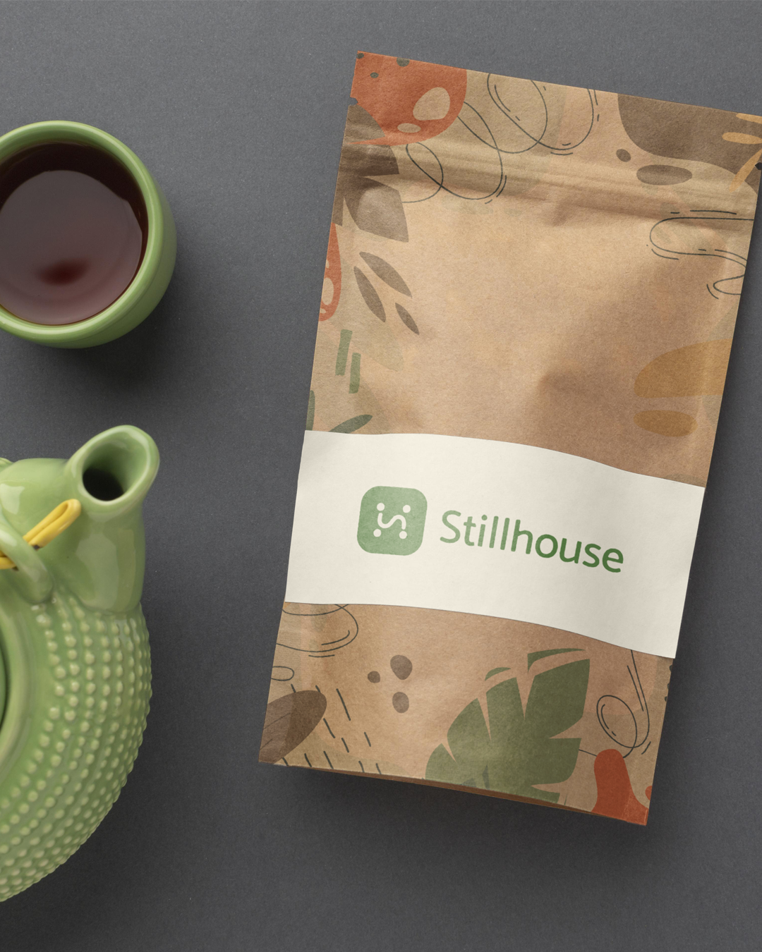
Packaging with eco-styled brand application

03. Color & Typography
Color Palette: Soft clay, herbal green, and off-white tones drawn from nature
Typography: A modern serif paired with a neutral sans-serif for warmth and clarity
The visual system reflects organic elegance — usable on both kraft textures and clean digital screens

Muted earth tones representing calm & nature

Everyday objects reflect the brand’s calm visual identity
Stillhouse is a brand that speaks softly, yet stays with you. The identity blends visual calm with emotional resonance — crafted to reflect a lifestyle that values depth over noise.